NOTE: As I have only beginner-level knowledge in statistics, much of the reasoning might not substantiated properly and depend on my intuition.
Observation
First, I observed a plycount of several maps to see how the playcount increase.
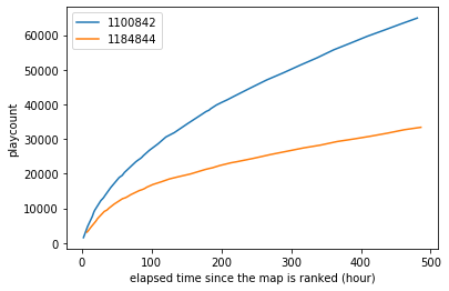 Playcount increase of beatmapsetID 1100842 and 1184844
Plotted maps:
From the graph above, I assumed that playcount is augmented polynomially by time (i.e. $y=ax^t$). Thus, based on this assumption, the playcount at the certain time can be expressed in a following formula: \(p = c \cdot t^a\) where $p$ is a playcount, $c$ is an imaginary popularity index, and $t$ is an elapsed time from the map being ranked.
Finding a model
I wanted to find the unknown $a$ in the formula above, which shows speed of increase. To find $a$, I performed a linear regression for maps which have a playcount record of 7th day after being ranked. I normalized the maps’ playcount by dividing all playcount records by the playcount of 7th day after being ranked (i.e. making the playcount of 7th day one). As a result, I got the following graph.
 time~normalized playcount graph
The vertical dotted line is $x=7.0$, and the horizontal dotted line is $y=1.0$. As playcounts are normalized, All lines on the graph should pass through the intersection of dotted lines.
We can notice that every line on the graph regresses to a certain curve, whose form is $y = ax^b$. As a regression problem to a curve $y = ax^b$ is solvable by taking log to both side, I take log to elapsed time and normalized playcount.
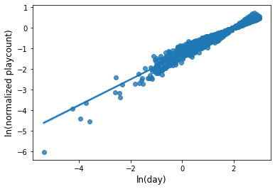
The regression line in the graph above is $\ln y = 0.624\ln x + 0.288$.
\[\ln y = 0.624\ln x + 0.288 \iff y = 0.288x^{0.624} (x, y \ge 0)\]What 0.288 and 0.624 mean? Actually 0.288 is not important because that is an arbitrary number resulted from normalization. What is important is 0.624. It shows the increasing rate of playcounts! So we can think that a map’s playcount $p$ can be modeled by the formula $p = ct^{0.624}$, where $c$ is a popularity index.
 The first model. The dotted line is the regression line.
Expansion to old maps
But unfortunately, the number 0.624 is not enough to conclude the research. This value is drawn from only lately ranked maps! To explain as many maps as possible, we should consider old maps too. For this, I took the following strategies.
-
I expanded the subject of study from maps which have a record of 7th day to maps ranked in and after 2015. Maps before 2015 were not considered because they are out-dated (or even abandoned) and thus do not reflect current trend of play enough.
-
I calculated a speed of playcount increase (i.e. slope in the graph) rather than normalizing all maps. If a playcount of some map increases in $p = ct^a$, then the playcount divided by $t^b$ would be a constant $c$. As a slope—speed of increase—of a constant function is 0, I aim to get the value of power of t (i.e. $a$ in $ct^a$) where mean of all speed of increase becomes 0.
-
Plus, I expected the model $p = ct^{0.624}$ would not be so wrong. Even the more accurate figure would be around 0.624.
As I don’t have mathematical basis to calculate the value, I just substituted several values. Then I found that when $a=0.7$, the mean of slopes is -0.43 and standard deviation of slopes is 81.93 (where total 6,803 maps were considered).
By conducting t-test, You can reject the null hypothesis (H0: $\mu \neq 0$) and be confident that the estimation that mean of slopes is 0 is true. As shown in the histogram below, the distribution of slopes is normal, so you can use t-test.
 Histogram of all slopes
 Enlargement of the slope [-100, 100]
Conclusion
-
The playcount of a map at the certain time is expected to be $p = c \cdot t^{0.7}$, where p is a playcount, t is elapsed time since the map being ranked, and c is the popularity index.
-
Thus, the popularity index of a map can be calculated by $c = p \cdot t^{-0.7}$.
Gallery of the model vs actual playcount
- Well fit
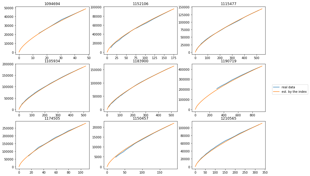
Title of each subplot is an ID of a plotted map. x-axis is the time from being ranked (hour) and y-axis is playcount of the map.
- Or not…
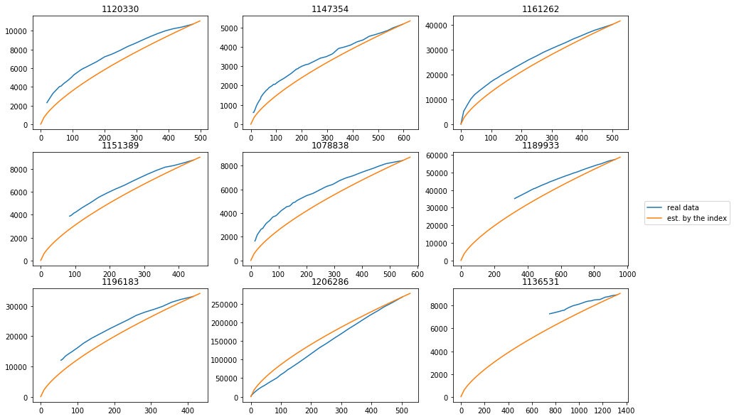
It seems that so-called pp maps are well modeled by this.
I’m afraid that there does not exist a test of the model. I don’t have any idea how to test its validity :(
Limitations of this study
- Short maps are likely to have more playcounts than the longer ones. Although it is not verified, it is highly likely to be so. This factor can prevent the “popularity rate” from showing its pure popularity.